Analytical Paragraph Writing/Information Transfer/Non Verbal-Verbal

An analytical paragraph explains data or information presented in a chart, graph, table, or diagram in a clear and logical way. It describes the main points, trends, and comparisons without adding personal opinions. The paragraph usually starts by introducing the data, highlights key observations or patterns, compares relevant details, and ends with a conclusion or summary of the overall trend. It is written in simple, factual language and focuses only on the information provided.
Examples
1. Pie Chart Analysis: Favorite Subjects of Students: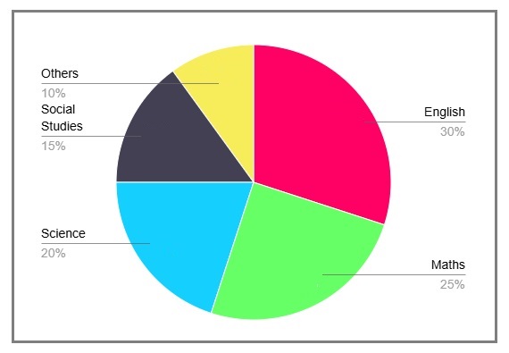 Question:
The pie chart shows the favorite subjects of students in a class. English: 30%, Mathematics: 25%, Science: 20%, Social Studies: 15%, Others: 10%. Write an analytical paragraph.
Answer:
The given pie chart represents the favorite subjects of students in a class. English is the most popular subject, chosen by 30% of students. Mathematics follows closely with 25%, showing that students also enjoy problem-solving. Science is liked by 20%, indicating a significant interest in experiments and discoveries. Social Studies accounts for 15%, while only 10% of students prefer other subjects. Overall, the chart highlights a strong preference for English and Mathematics among students, while Social Studies and other subjects are less popular.
![]() 2. Bar Graph Analysis: Monthly Rainfall in a City
2. Bar Graph Analysis: Monthly Rainfall in a City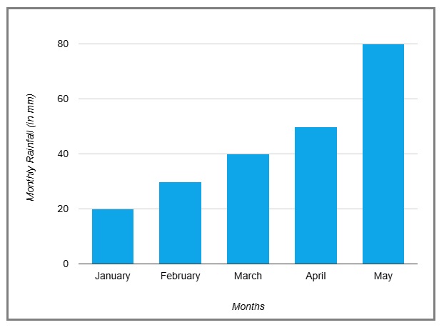 Question:
The bar graph shows monthly rainfall (in mm) in a city: January (20 mm), February (30 mm), March (40 mm), April (50 mm), and May (80 mm). Write an analytical paragraph.
Answer:
The bar graph illustrates the monthly rainfall in a city from January to May. Rainfall increases steadily over these months. January records the lowest rainfall at 20 mm, followed by a slight rise to 30 mm in February. In March, the rainfall increases to 40 mm and further to 50 mm in April. May experiences the highest rainfall at 80 mm. This trend suggests a gradual transition from a dry to a wet season in the city during this period.
![]() 3. Table Analysis: Student Performance in Different Subjects
3. Table Analysis: Student Performance in Different Subjects
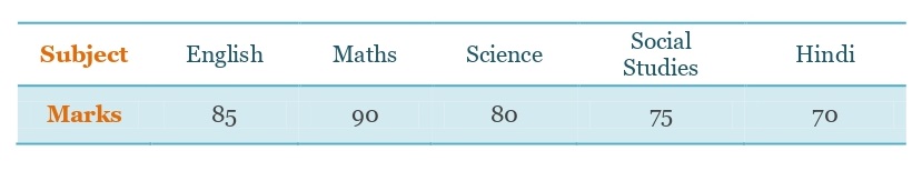 Question:The table shows the marks scored by a student in five subjects: English (85), Mathematics (90), Science (80), Social Studies (75), and Hindi (70). Write an analytical paragraph.
Answer:
The table presents the marks scored by a student in five subjects. The student has performed best in Mathematics with 90 marks, showing strong analytical skills. English comes next with 85 marks, reflecting good language proficiency. Science follows with 80 marks, indicating a good understanding of concepts. Social Studies and Hindi have relatively lower scores of 75 and 70, respectively. Overall, the student has excelled in Mathematics and English but needs to focus more on Hindi and Social Studies to achieve better results.
![]() 4. Line Graph Analysis: Population Growth in a Village (2010–2020)
4. Line Graph Analysis: Population Growth in a Village (2010–2020)
 Question:
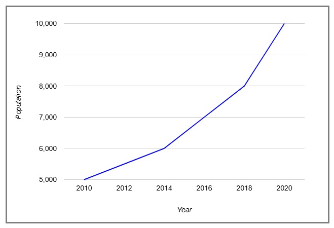
The line graph shows the population of a village from 2010 to 2020: 2010 (5,000), 2012 (5,500), 2014 (6,000), 2016 (7,000), 2018 (8,000), 2020 (10,000). Write an analytical paragraph.
Answer:
The line graph depicts the population growth of a village from 2010 to 2020. The population shows a steady increase over the years. In 2010, it was 5,000 and rose to 5,500 in 2012. By 2014, it reached 6,000, followed by a significant rise to 7,000 in 2016. The population continued to grow, reaching 8,000 in 2018 and finally 10,000 in 2020. This trend reflects rapid growth, possibly due to better living conditions and opportunities in the village.
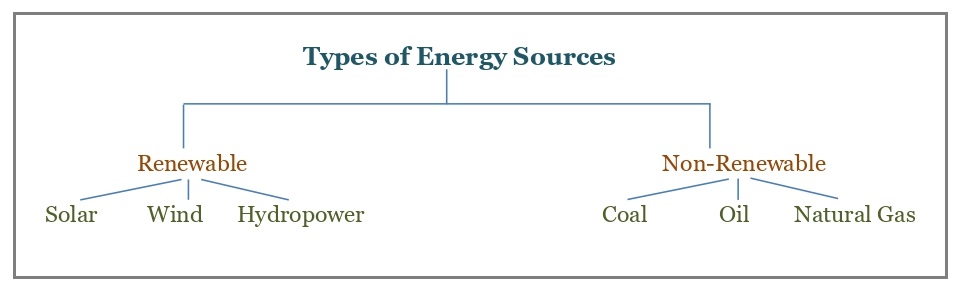
![]() 5. Tree Diagram Analysis: Types of Energy Sources
5. Tree Diagram Analysis: Types of Energy Sources
 Question:
The tree diagram shows the types of energy sources: Renewable (Solar, Wind, Hydropower) and Non-Renewable (Coal, Oil, Natural Gas). Write an analytical paragraph.
Answer:
The tree diagram categorizes energy sources into renewable and non-renewable types. Renewable sources include solar, wind, and hydropower, which are environmentally friendly and sustainable. These sources depend on natural elements like sunlight, wind, and water. On the other hand, non-renewable sources include coal, oil, and natural gas, which are limited in supply and contribute to pollution. The diagram highlights the importance of increasing the use of renewable energy to reduce environmental harm and conserve non-renewable resources for future generations.
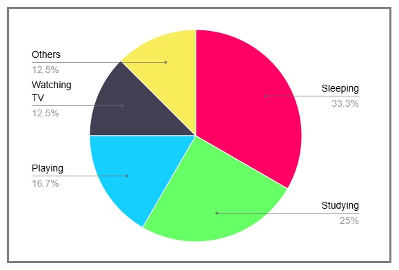
![]() 6. Pie Chart: Time Spent on Daily Activities
6. Pie Chart: Time Spent on Daily Activities
 Question:
The pie chart shows how a student spends 24 hours in a day: Sleeping (8 hours), Studying (6 hours), Playing (4 hours), Watching TV (3 hours), Others (3 hours). Write an analytical paragraph.
Answer:
The given pie chart illustrates how a student spends 24 hours of their day. Sleeping takes the largest portion of time, with 8 hours dedicated to rest. This is essential for maintaining good health and energy levels. The second-largest time allocation is for studying, which takes 6 hours, reflecting the student’s focus on academics. Playing accounts for 4 hours, indicating the importance of physical activity and relaxation in their daily routine. Watching TV consumes 3 hours, showing moderate use of entertainment media. Other activities, such as eating, family time, and hobbies, also take up 3 hours. Overall, the chart demonstrates a balanced routine, ensuring sufficient time for rest, work, and recreation.
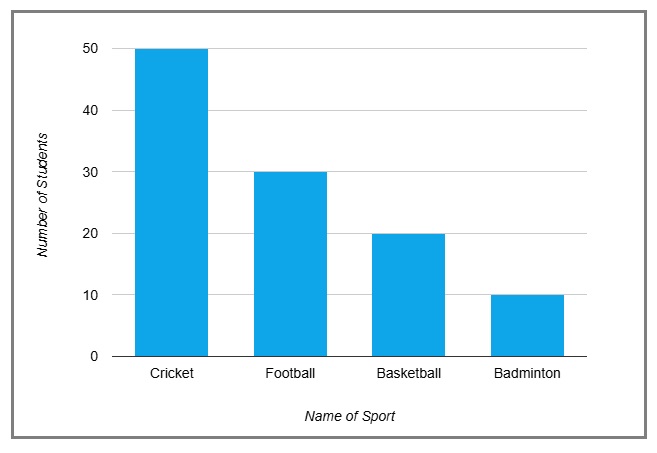
![]() 7. Bar Graph: Favorite Sports of Students
7. Bar Graph: Favorite Sports of Students
 Question:
The bar graph shows students’ favorite sports: Cricket (50), Football (30), Basketball (20), Badminton (10). Write an analytical paragraph.
Answer:
The bar graph highlights the favorite sports among students. Cricket emerges as the most popular choice, with 50 students expressing their preference for the game. This suggests its widespread appeal and dominance as a national sport. Football, with 30 students, is the second favorite, reflecting its global popularity. Basketball attracts 20 students, showing its growing influence. Badminton, with only 10 students, is the least popular, perhaps due to fewer facilities or lack of interest. The graph underscores the strong preference for outdoor team sports like cricket and football over individual games like badminton.
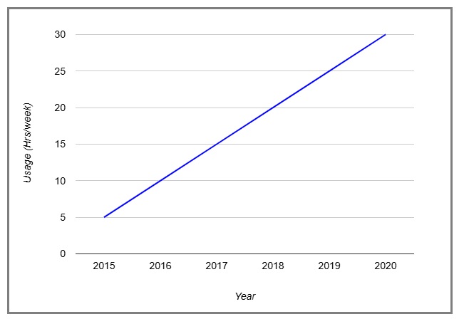
![]() 8. Line Graph: Internet Usage Over Five Years
8. Line Graph: Internet Usage Over Five Years
 Question:
The line graph shows internet usage (in hours per week) from 2015 to 2020: 2015 (5), 2016 (10), 2017 (15), 2018 (20), 2019 (25), 2020 (30). Write an analytical paragraph.
Answer:
The line graph shows a clear upward trend in internet usage over five years, from 2015 to 2020. In 2015, people spent just 5 hours per week online. By 2016, this doubled to 10 hours, indicating the increasing integration of the internet into daily life. Usage rose steadily to 15 hours in 2017 and 20 hours in 2018. The sharpest increase occurred between 2018 and 2020, reaching 30 hours per week. This growth reflects the growing reliance on the internet for communication, work, education, and entertainment. The trend suggests a digital shift in lifestyle and work patterns.
![]() 9. Table: Test Scores of a Class
9. Table: Test Scores of a Class
 Question:
The table shows average test scores: English (85), Mathematics (80), Science (78), Social Studies (72), Hindi (70). Write an analytical paragraph.
Answer:
The table reveals the average test scores of a class in five subjects. English has the highest average score of 85, reflecting strong language skills among students. Mathematics follows closely with an average of 80, indicating a good understanding of numerical concepts. Science scores an average of 78, showcasing moderate proficiency. Social Studies and Hindi have lower averages, at 72 and 70, respectively. This indicates that students might find these subjects more challenging. The table highlights the need for additional focus on Social Studies and Hindi to improve overall performance.
![]() 10. Tree Diagram: Food Categories
10. Tree Diagram: Food Categories
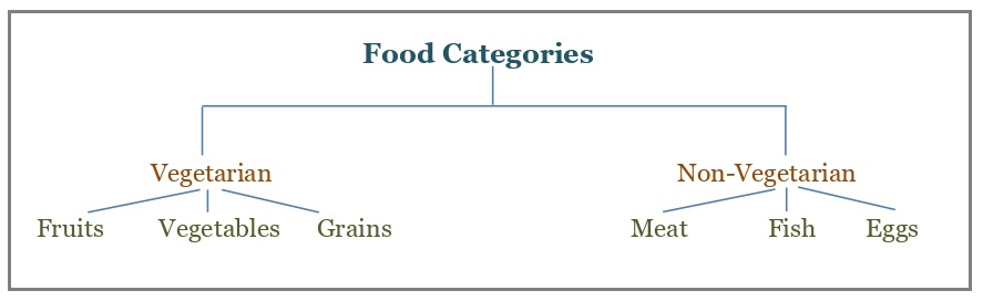 Question:
The diagram shows food categories: Vegetarian (Fruits, Vegetables, Grains) and Non-Vegetarian (Meat, Fish, Eggs). Write an analytical paragraph.
Answer:
The tree diagram categorizes food into vegetarian and non-vegetarian options. Vegetarian foods include fruits, vegetables, and grains, which are essential for a balanced diet. They provide vitamins, minerals, and fiber, supporting good health. Non-vegetarian foods like meat, fish, and eggs are high in protein, which is crucial for muscle development and energy. The diagram emphasizes the diversity of food choices and the importance of including both categories for balanced nutrition. It also highlights how food preferences can vary based on cultural, religious, and personal choices.
![]()
More examples will be added soon….